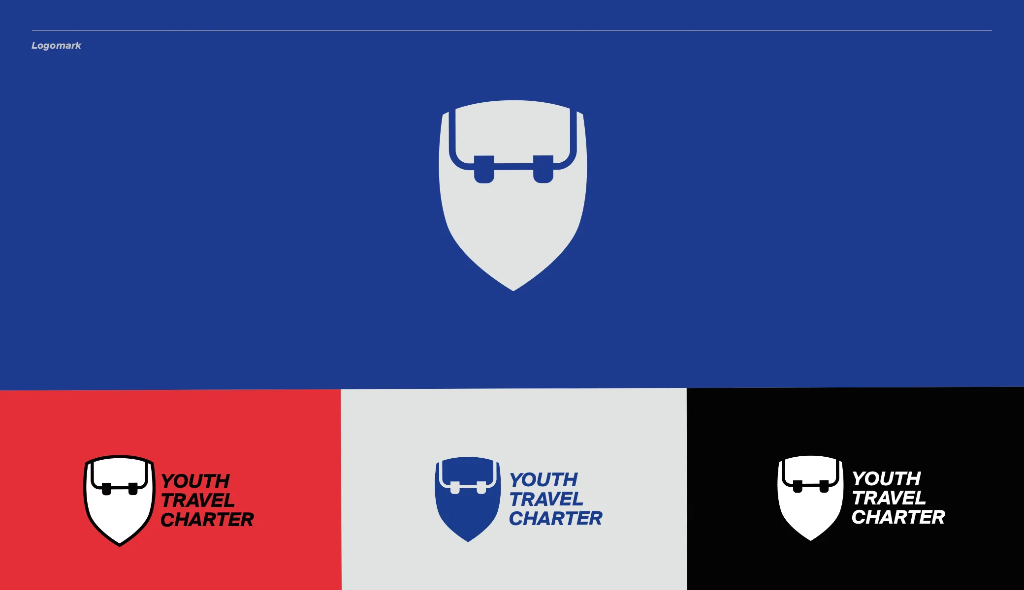
Logo
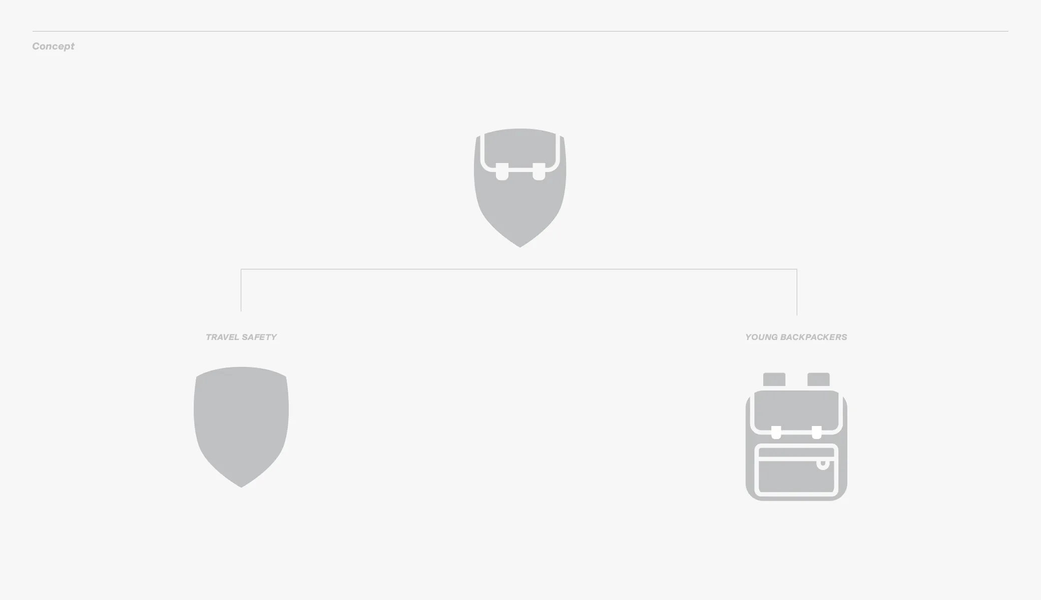
and process of its creationAfter setting the main goals of the projects and defining the target group, the logo became naturally a combination of both components.
I created the logo's shape in a style that is characteristic of me - mixing shapes that seem dissimilar and distant- to become a harmonious unity but are also noticeable as separate components. The typography that complements the logo is modern and minimalist yet charismatic in detail, reflecting the fearless nature of young adventurers.
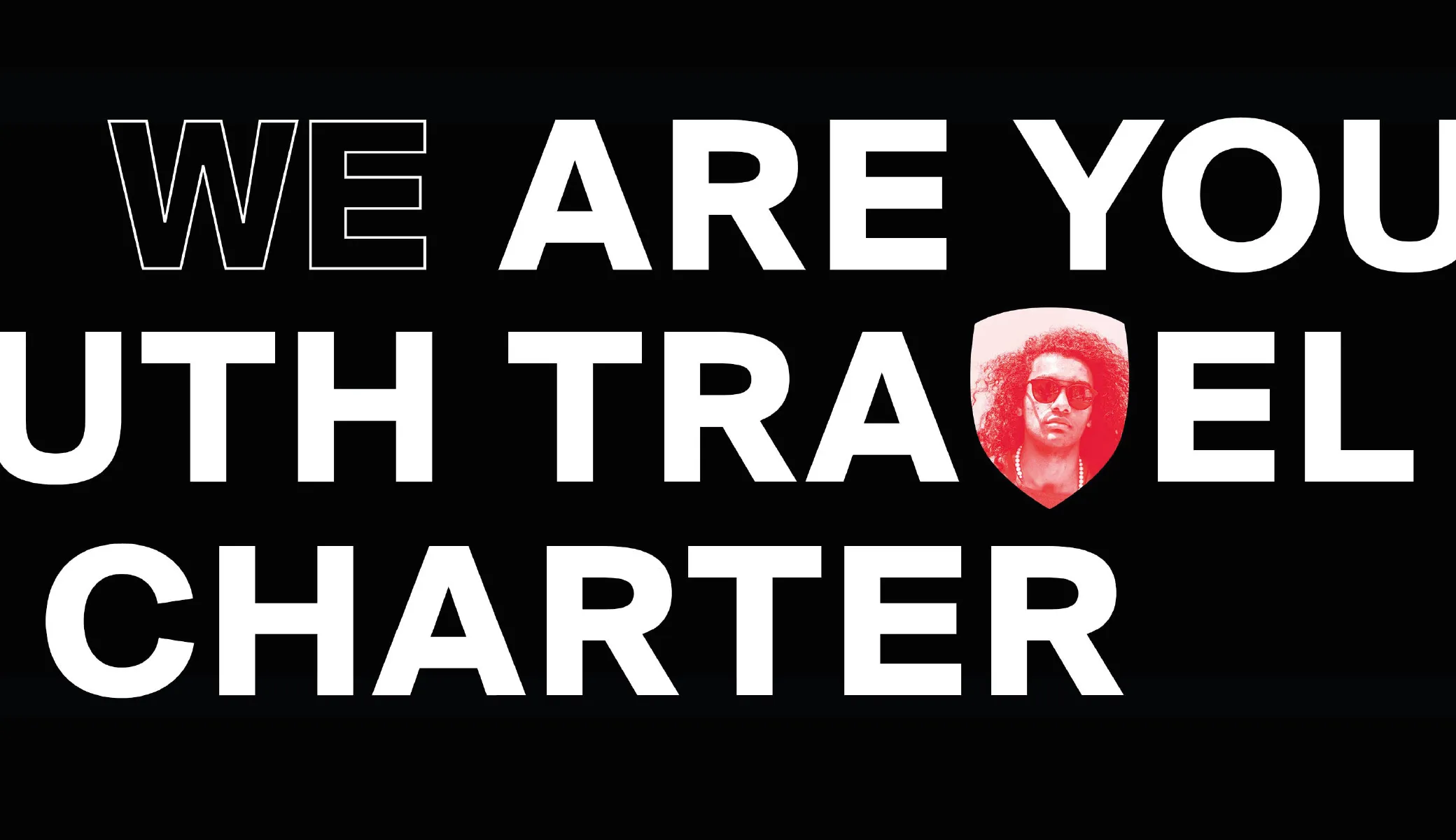
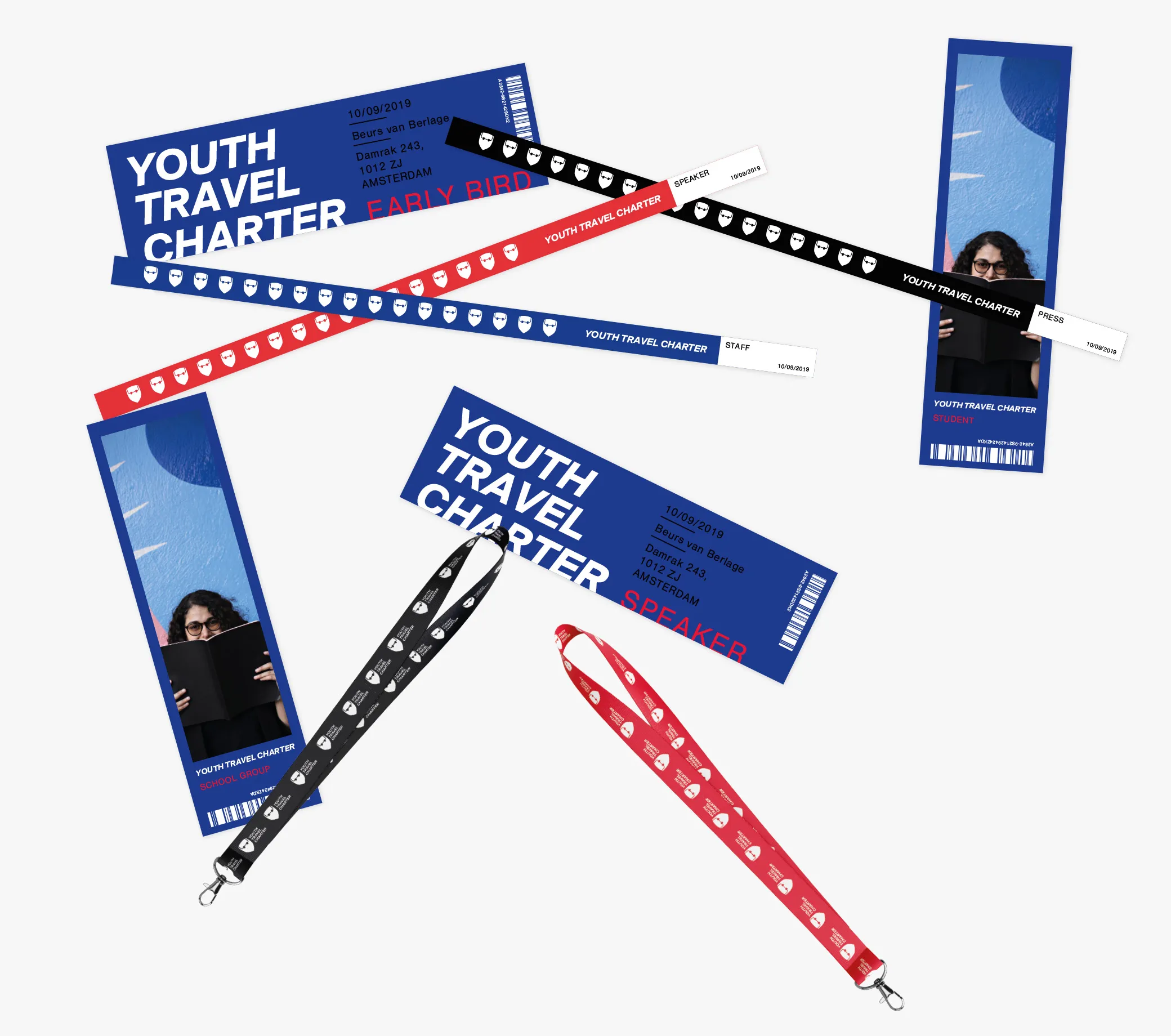
Sense of safety and awareness
blended with feeling indestructibleA sense of security and confidence is essential when traveling but is often overlooked at a young age. The importance of these issues has been emphasized in this project by providing information simply and efficiently that can be consulted even on the go.
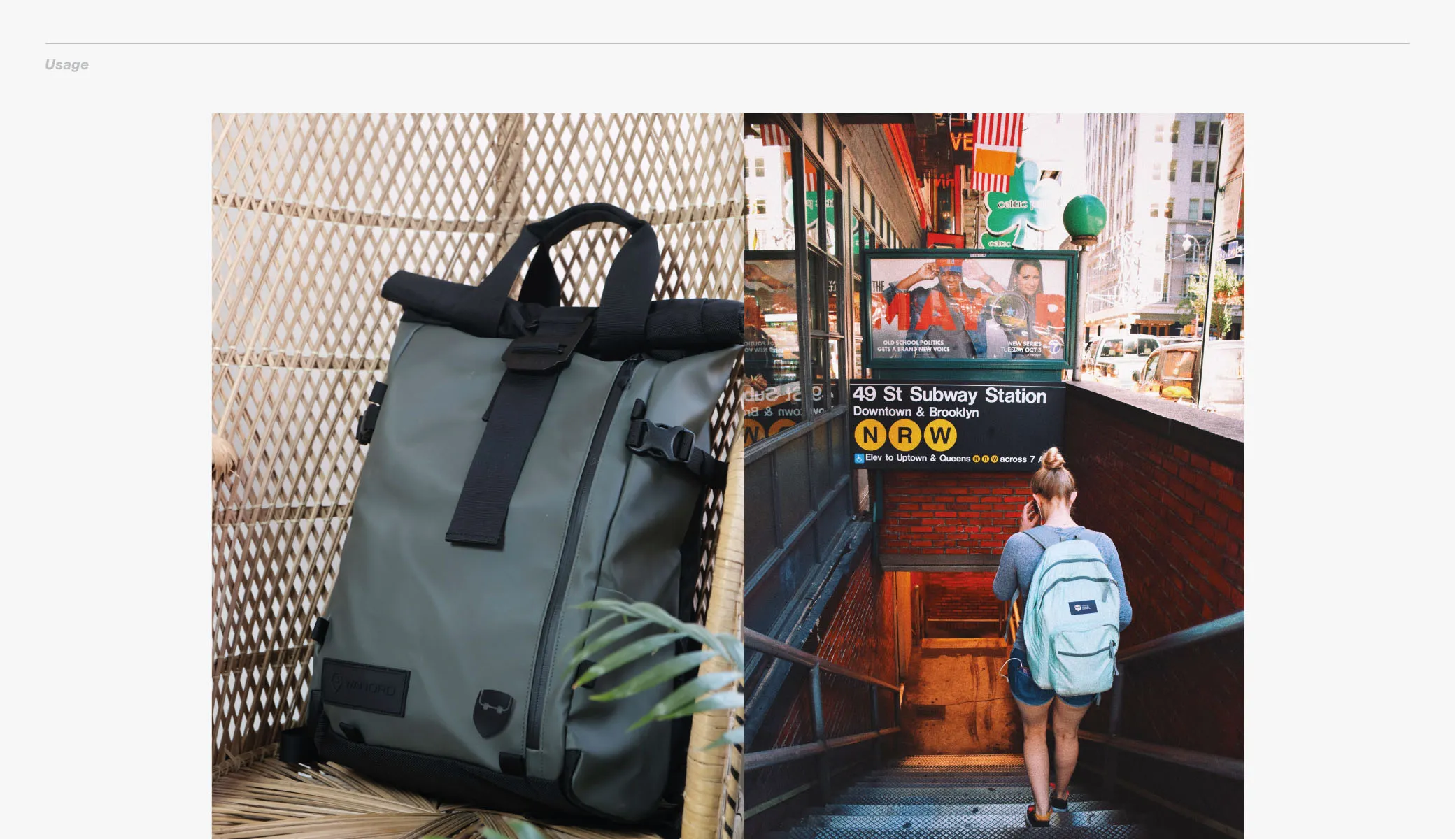
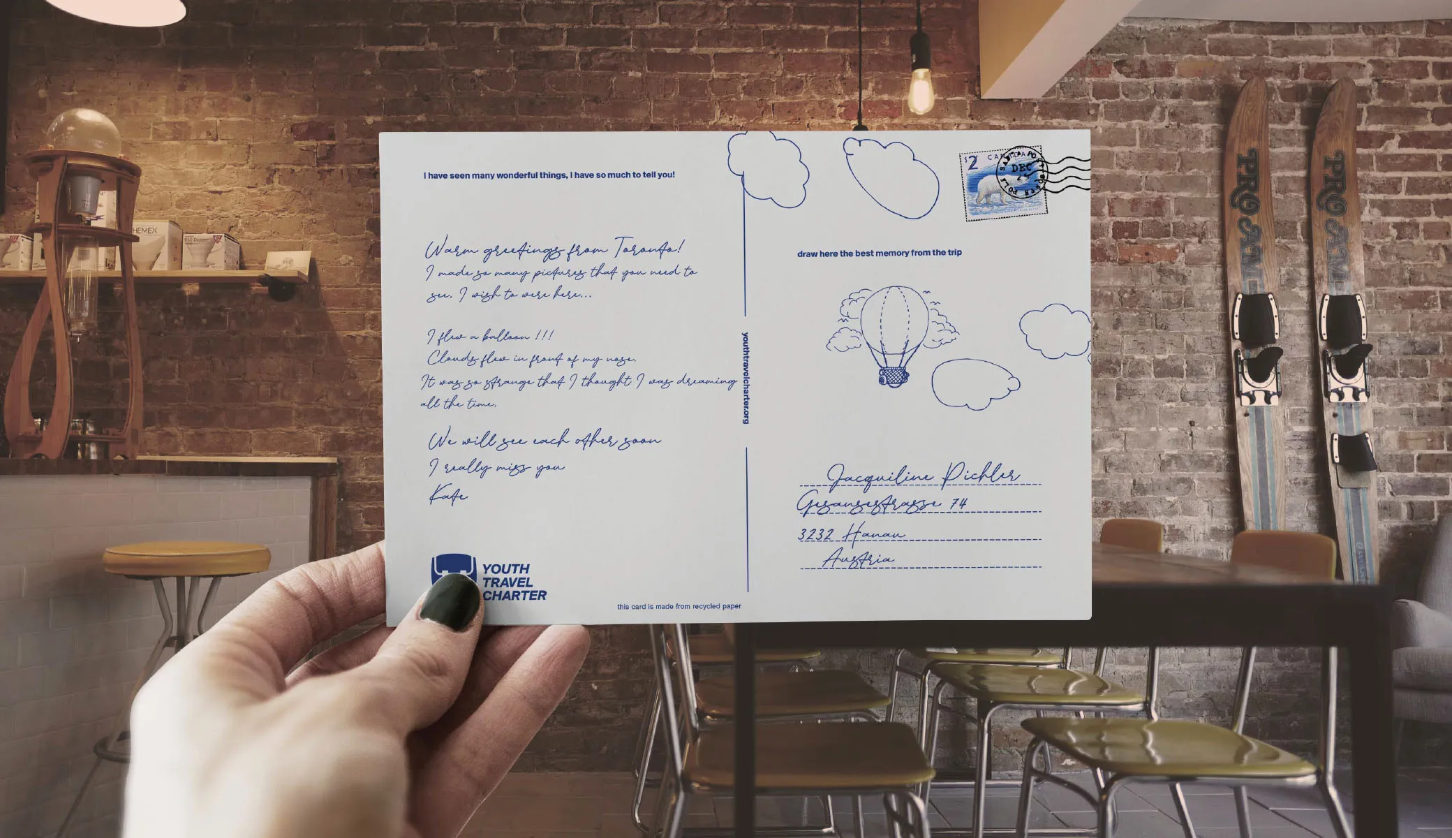
Sustainable development and responsible travel are not only slogans in this Charter. These values speak in non-print, digital reports, which are also easier to travel with, and only helpful travel gadgets - without producing unnecessary waste, the sole purpose of which is only to put a logo on it.
Sense of safety and awareness
blended with feeling indestructibleA sense of security and confidence is essential when traveling but is often overlooked at a young age. The importance of these issues has been emphasized in this project by providing information simply and efficiently that can be consulted even on the go.
Sustainable development and responsible travel are not only slogans in this Charter. These values speak in non-print, digital reports, which are also easier to travel with, and only helpful travel gadgets - without producing unnecessary waste, the sole purpose of which is only to put a logo on it.