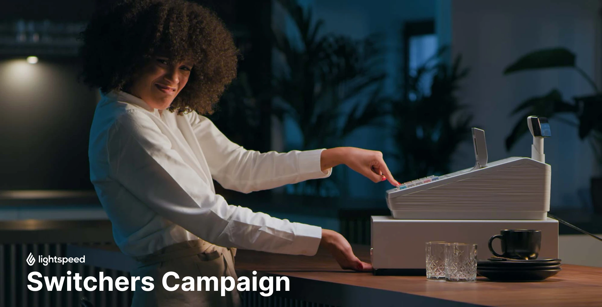
Leaving the old "discomfort" zone
breaking the habits shouldn’t be painfulIn this campaign, our goal was to show that habit should not be the only reason for sticking with old choices.
The campaign concept is based on the contrast of frustration with outdated solutions vs. the sense of comfort and intuitiveness provided by Lightspeed. The mood of the campaign is consistently based on warm, stable tones of brown enriched with creamy white and the red - the main color of the brand.


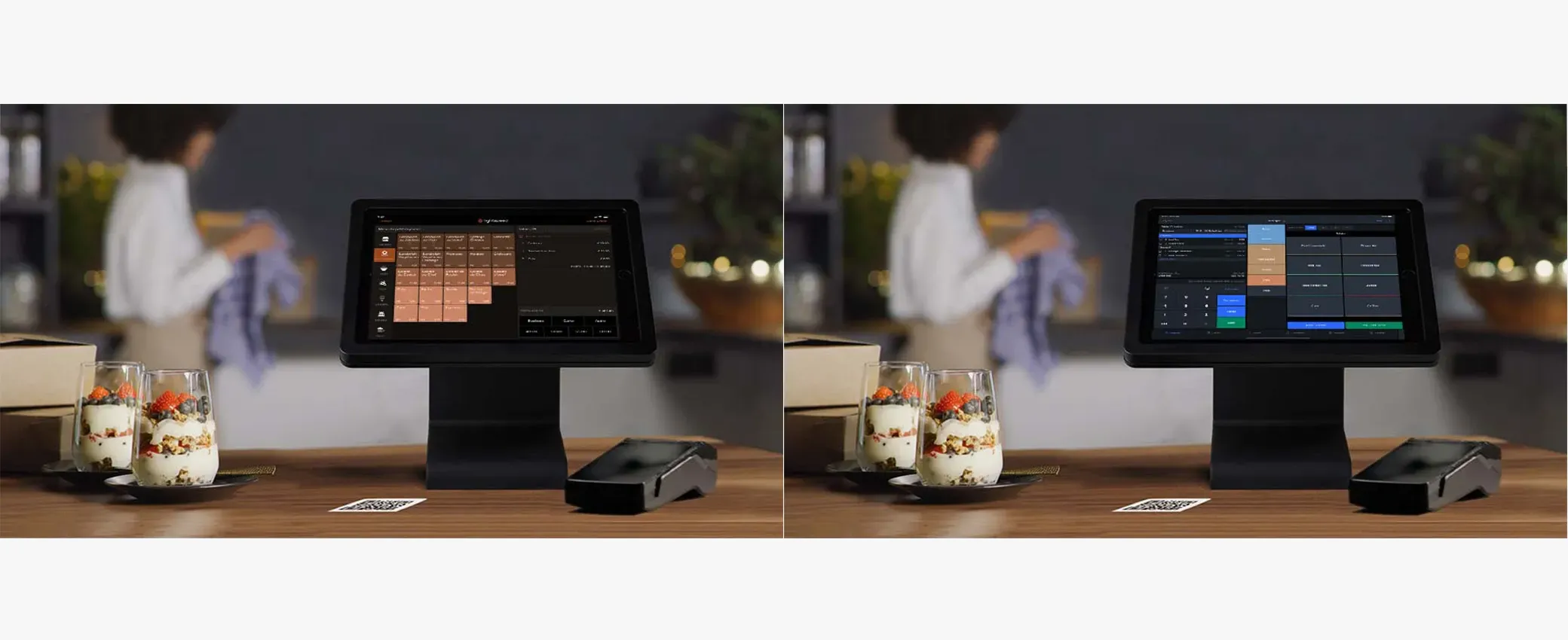
Various products and business needs
around the EMEA regionThe localization process is not based on changing the language, but on a thorough understanding of how the local market works, what opportunities it offers and what limitations lie behind them.
In the case of Lightspeed, these are various product variations, integrations and available payment systems, which are dictated by local legal regulations. All variables were included in the campaign's visual materials to reflect the 1:1 specificity of the global product on the local market.